@2x.png)
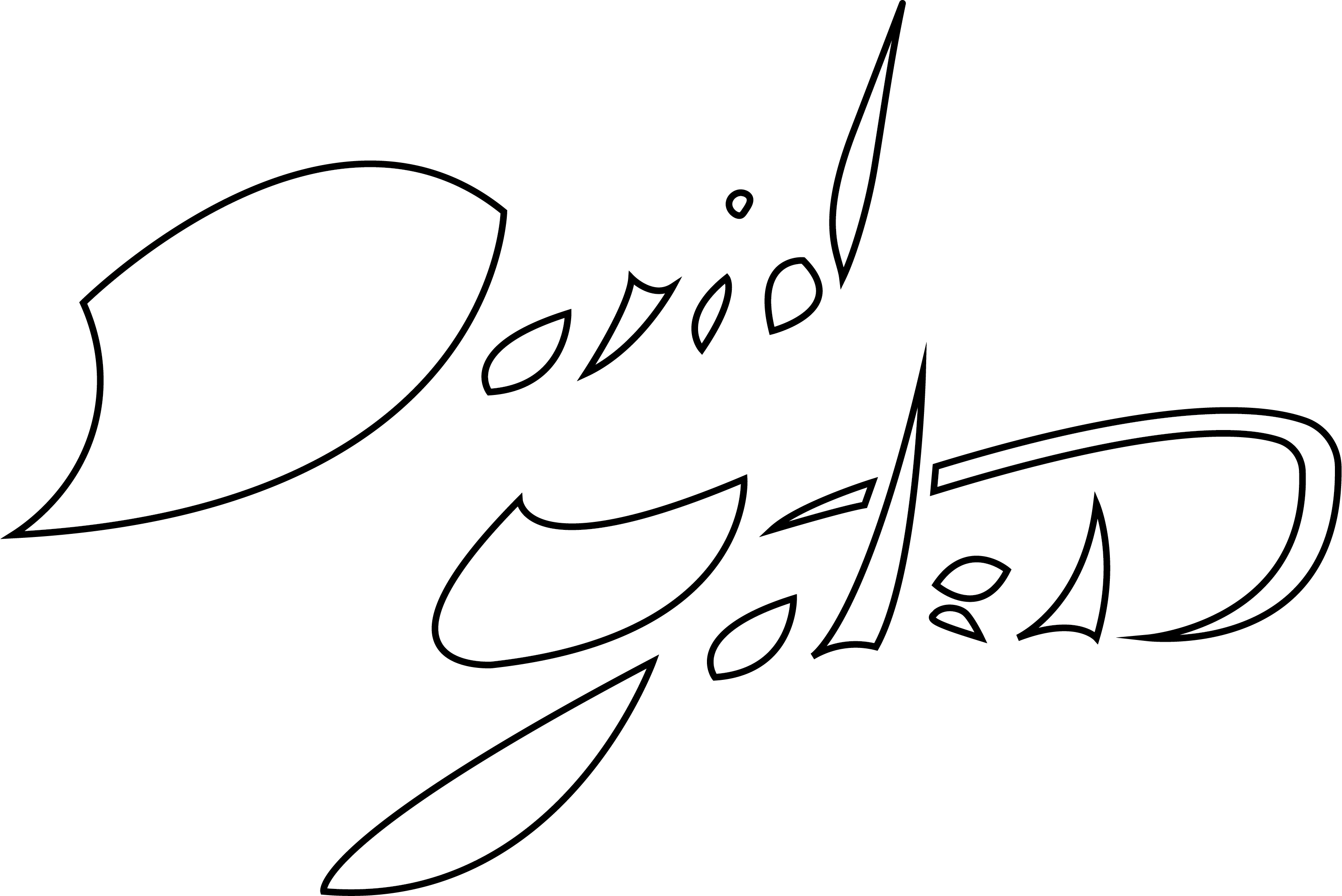
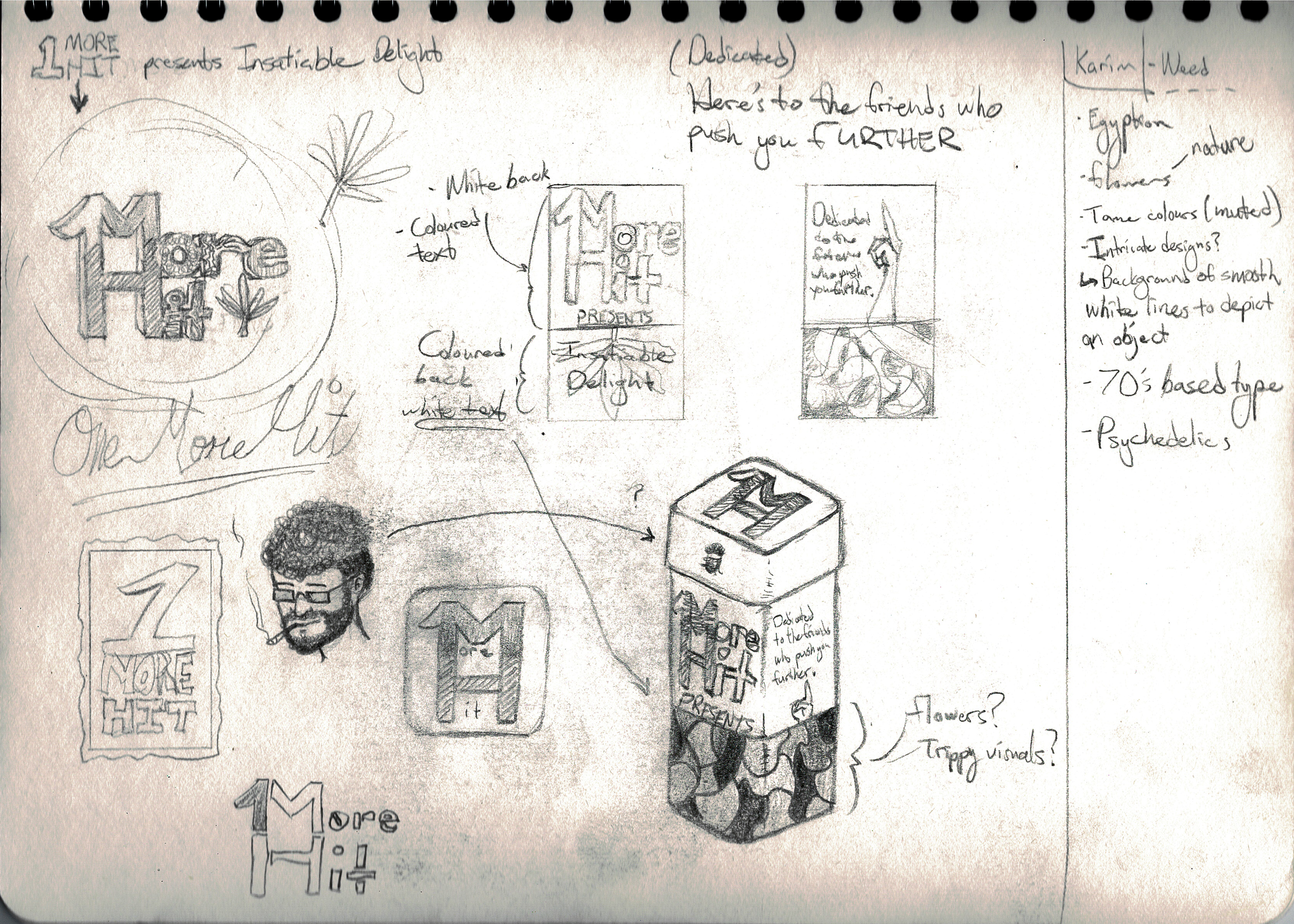
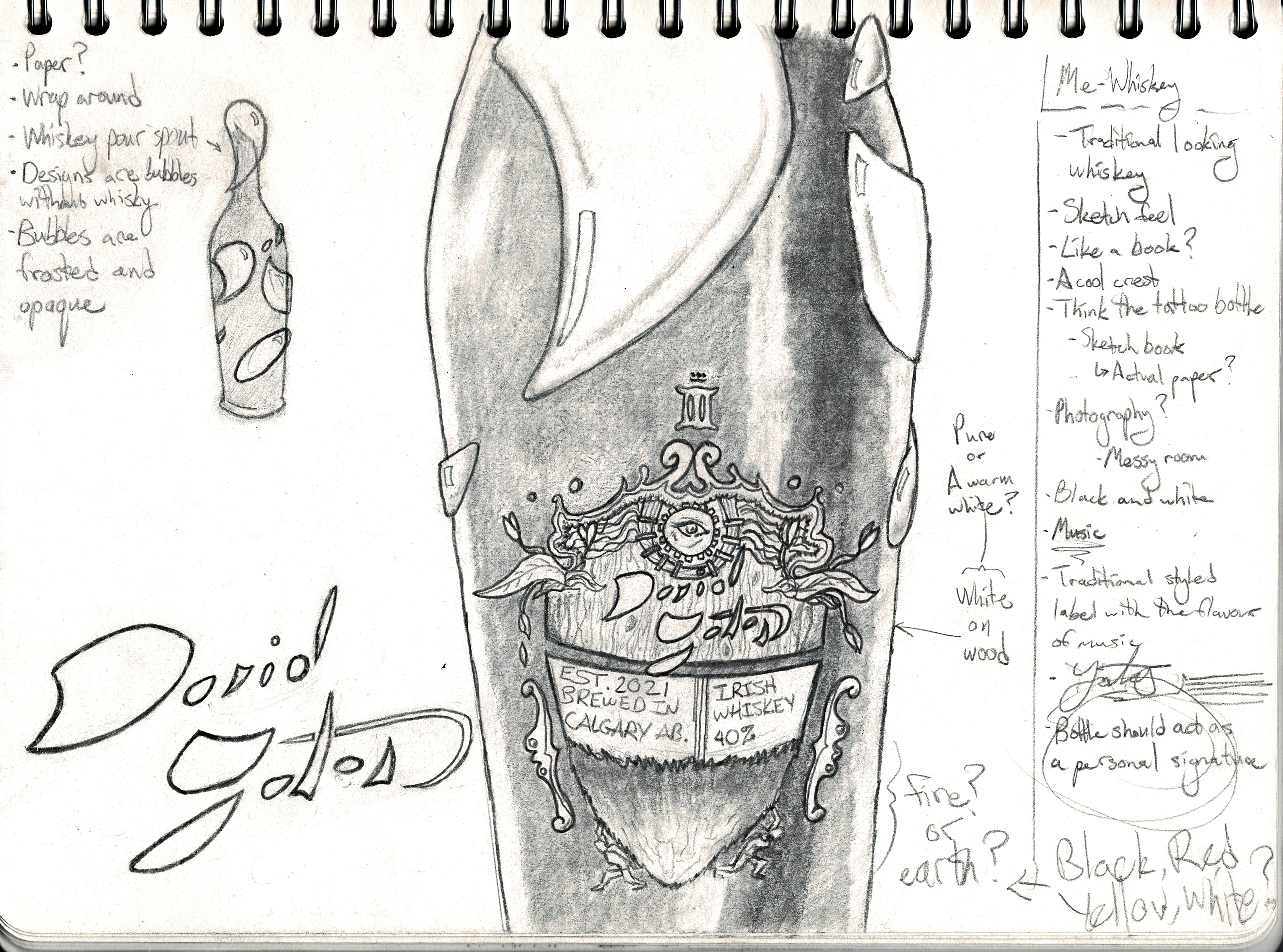
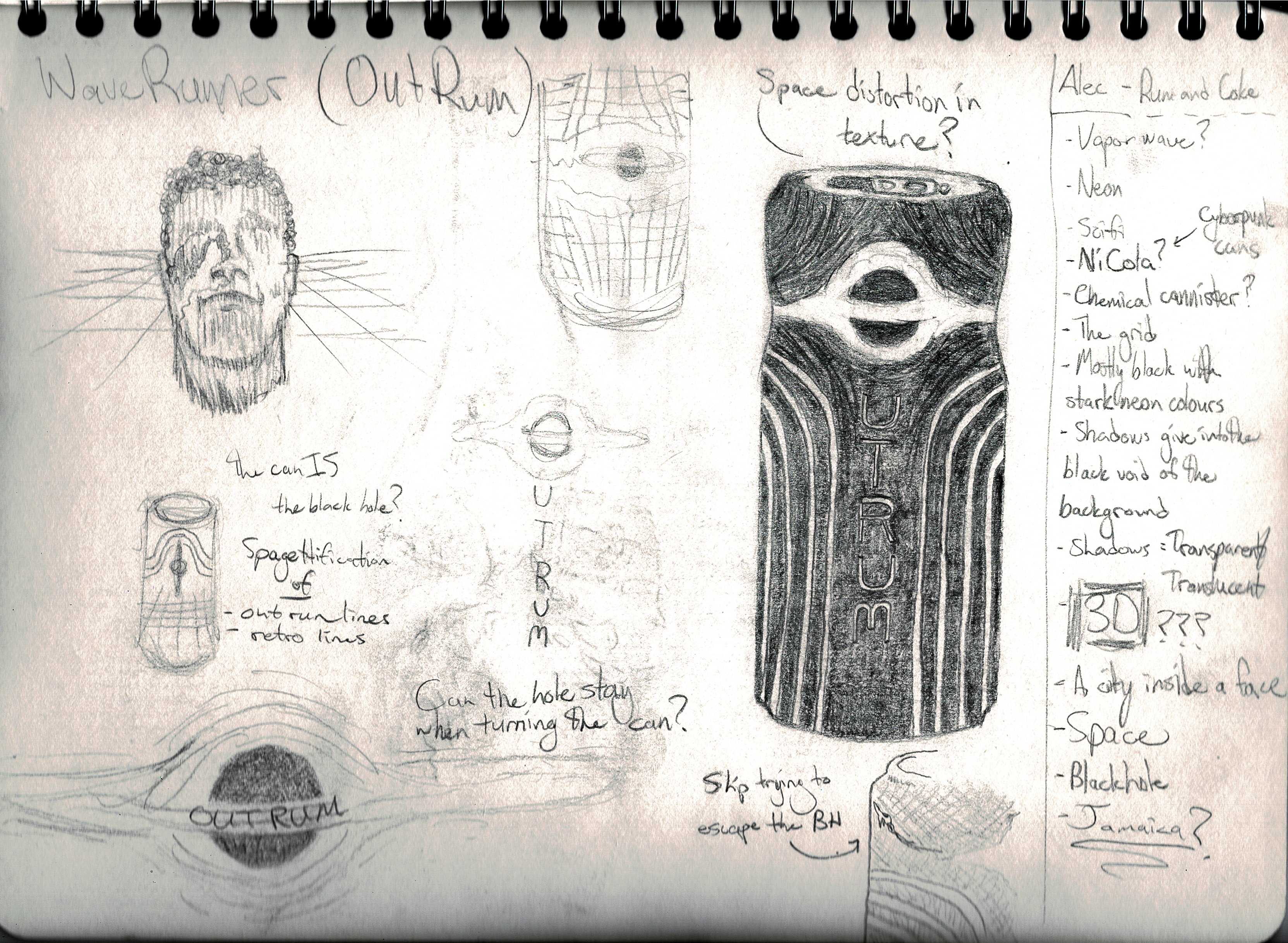
I have a particular passion for branding and an even more particular interest in liquor branding. I believe the medium has unlimited potential for creativity thanks to the versatility of glass. Despite that, when I peruse the liquor store I find very little variety apart from the brands unique sticker label. Through this project, I aim to create 5 liquor brands based off of each of my closest friends and take unique risks to change the way liquor bottles/cans are approached.
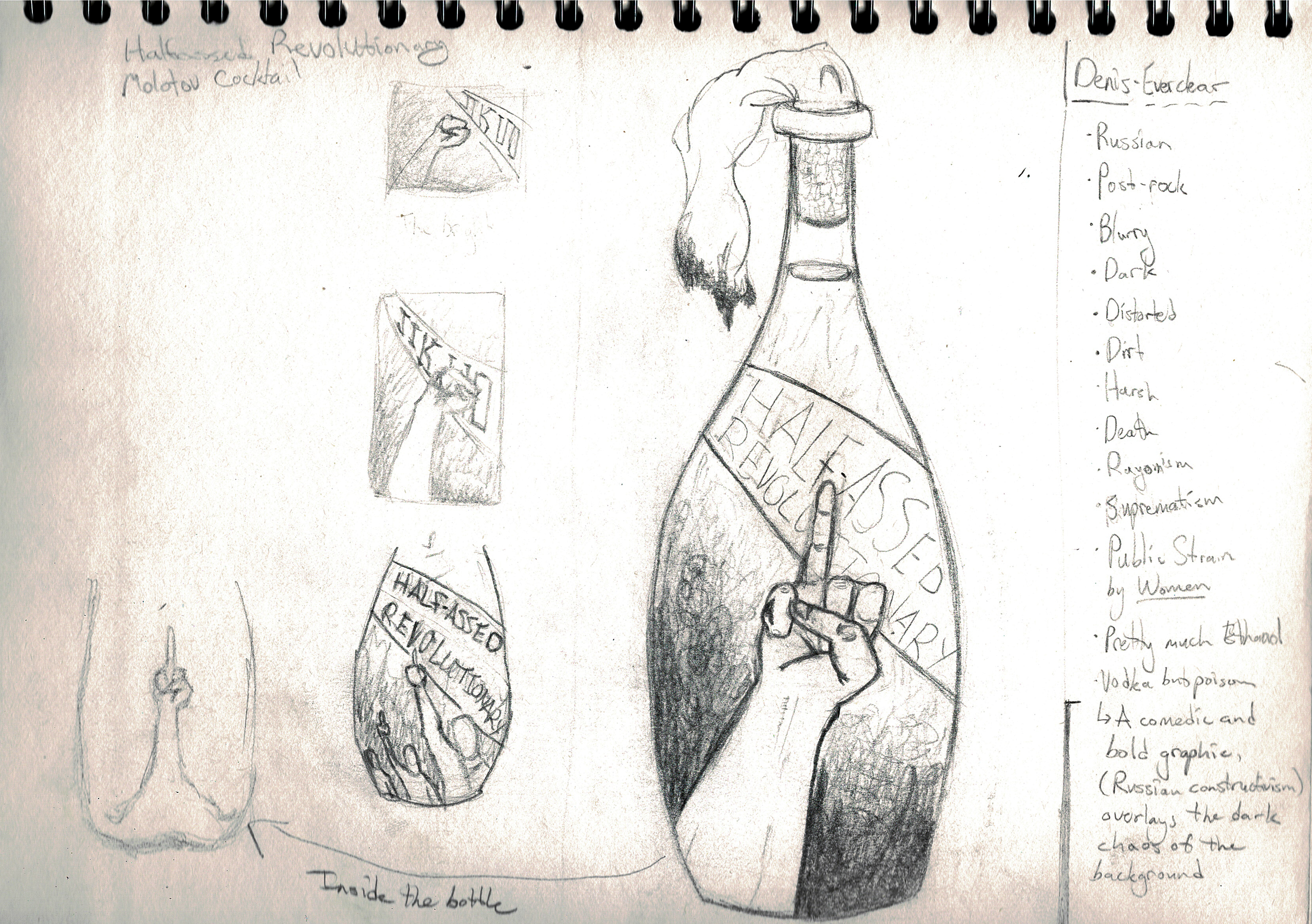
Half-Assed Revolutionary
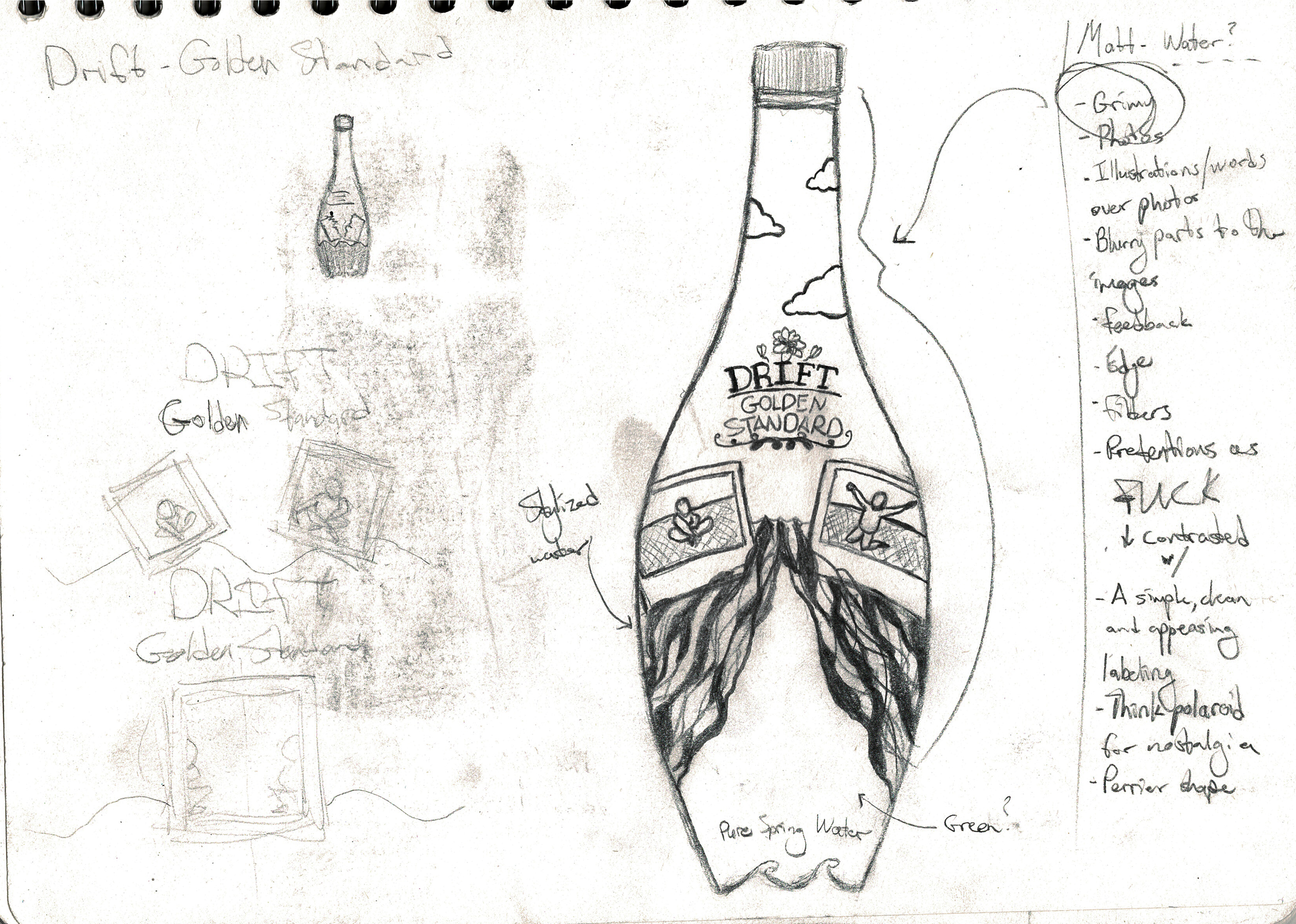
Drift
1More Hit