@2x.png)
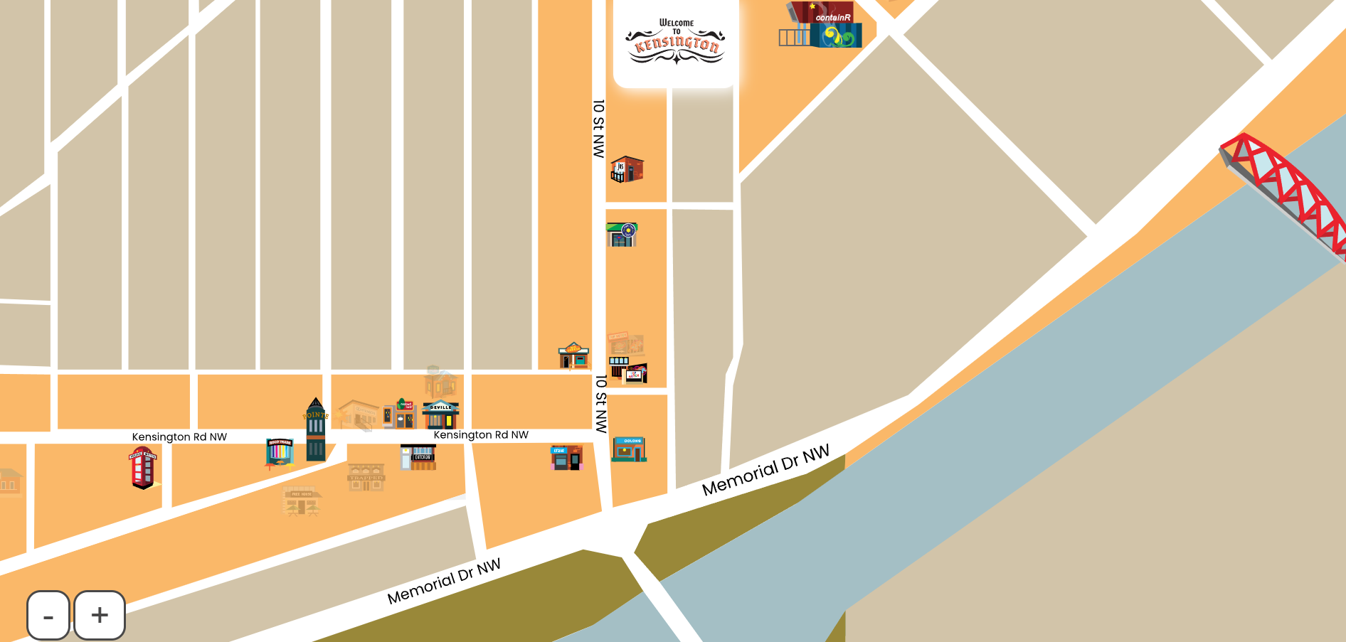
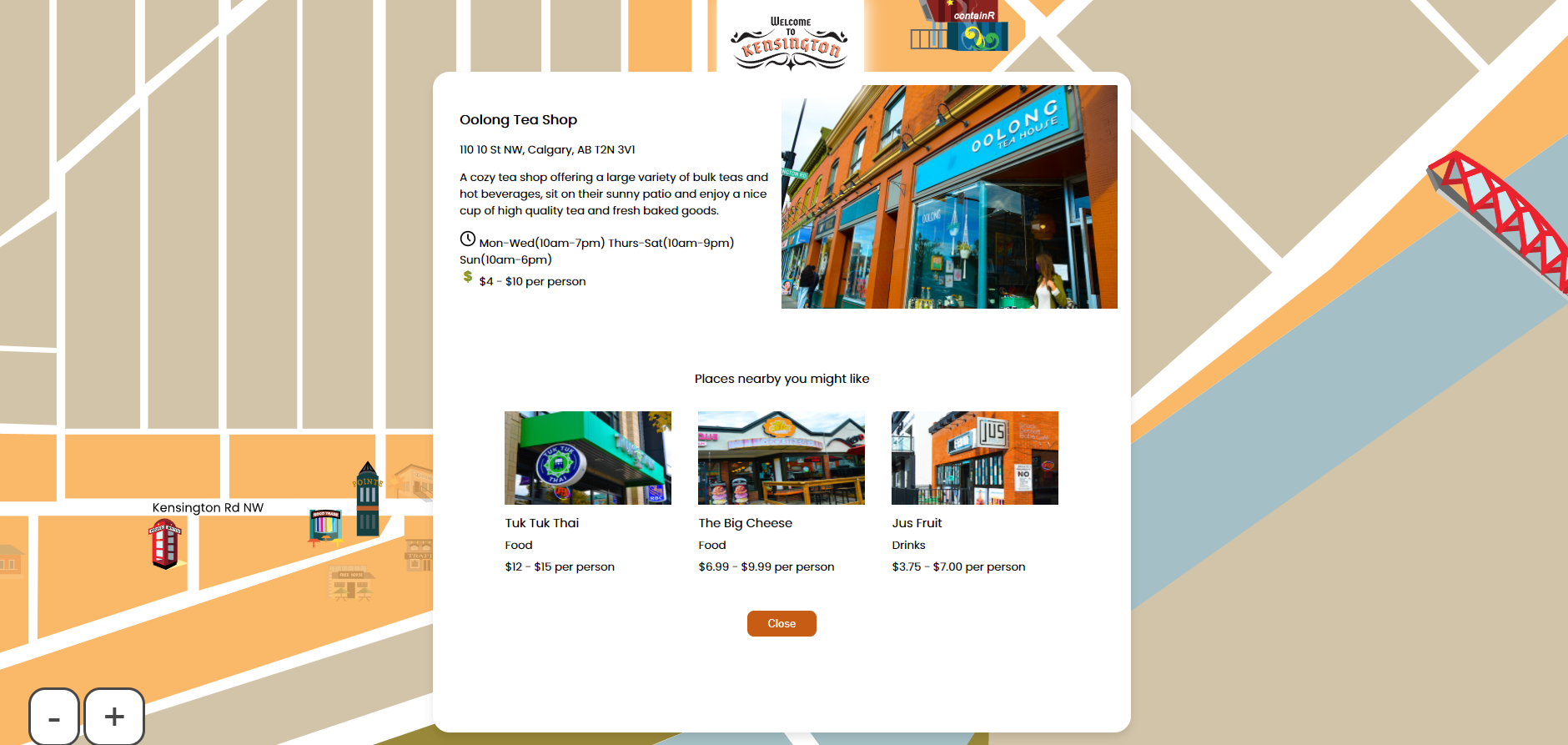
For this project, my team and I were asked to create an interactive map for a designated area within Calgary. We were assigned the beautiful, and culturally rich area of Kensington. The colours are drawn from old maps of the area and the modern, sleek graphics of each of the locations contrast it nicely. The user answers what they'd like to do in the area and when. They receive in turn a selection of which locations are open and which fit their wants for the evening.
VISIT THIS SITE.

My team and I were tasked with creating a site that would inform potential students about the NMPD program at SAIT. Because it's an all-intensive digital media program, we decided to tackle it from the angle of becoming a digital 'Chosen One.' The site couples stylistic graphics with smooth animations to keep the user entertained.
VISIT THIS SITE.


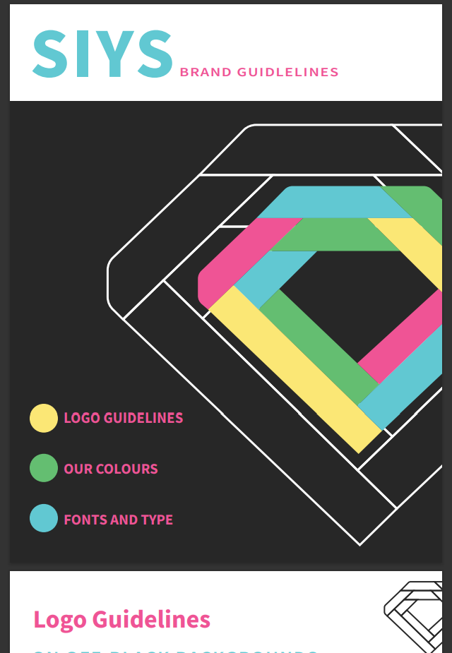
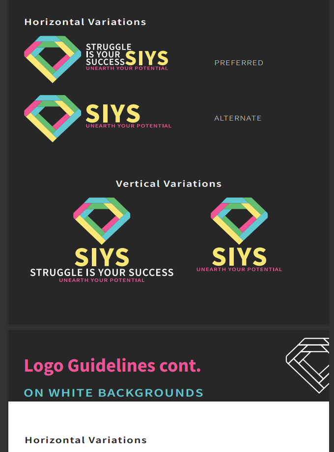
Struggle Is Your Success is an up-and-coming non-profit organization aimed at helping at-risk and struggling students find purpose through the thrill of entrepreneurship. They were looking for a fresh, fun and sophisticated look for their cause. The owner found that a diamond best represented the organization and so I focused on incorporating that symbolic shape. Using bright, and subtly pastel colours, the new SIYS identity gives off a youthful glow and creates a strong visual style when coupled with the wordmark, while retaining the meaning behind the non-profit's creation.
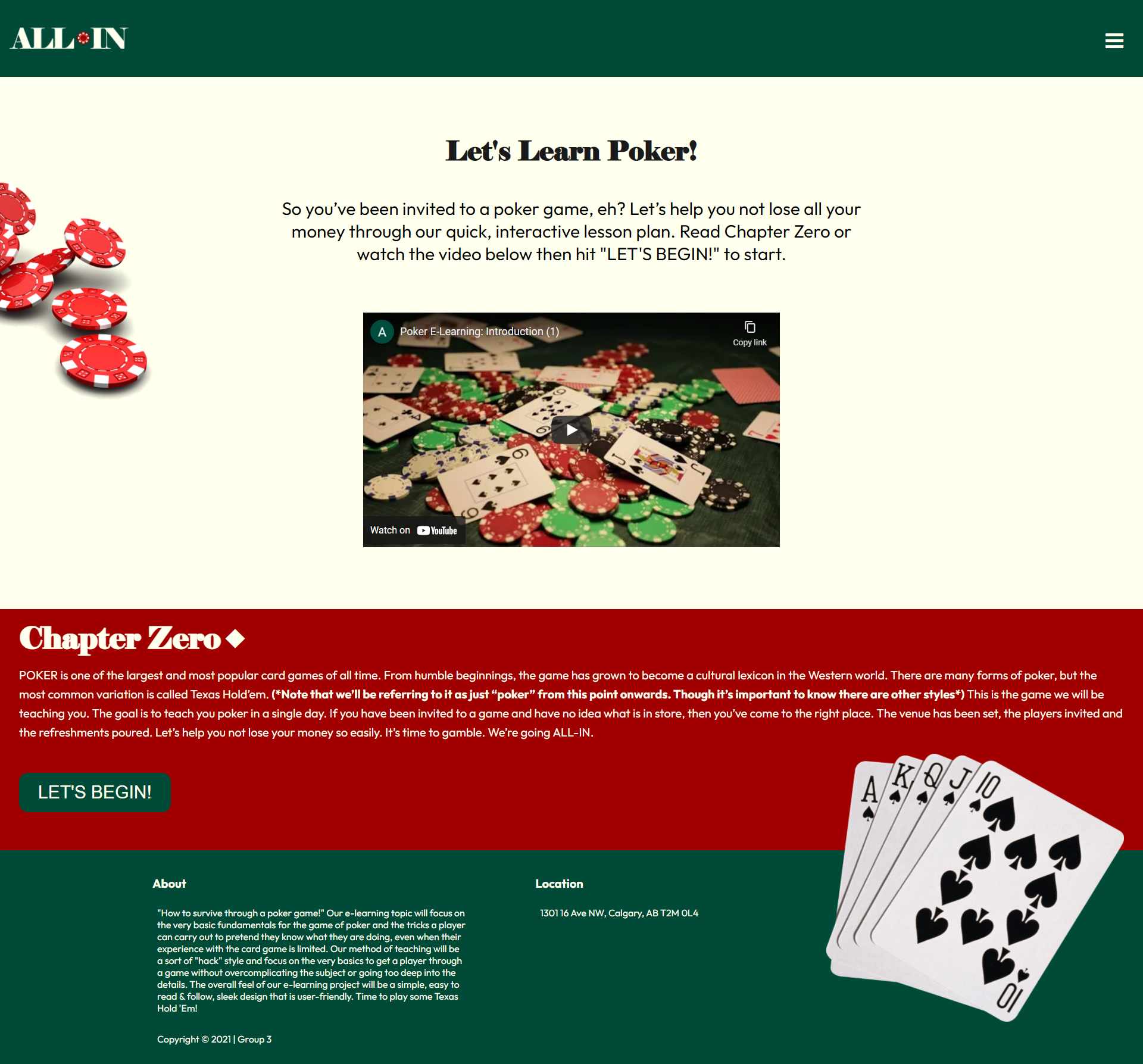
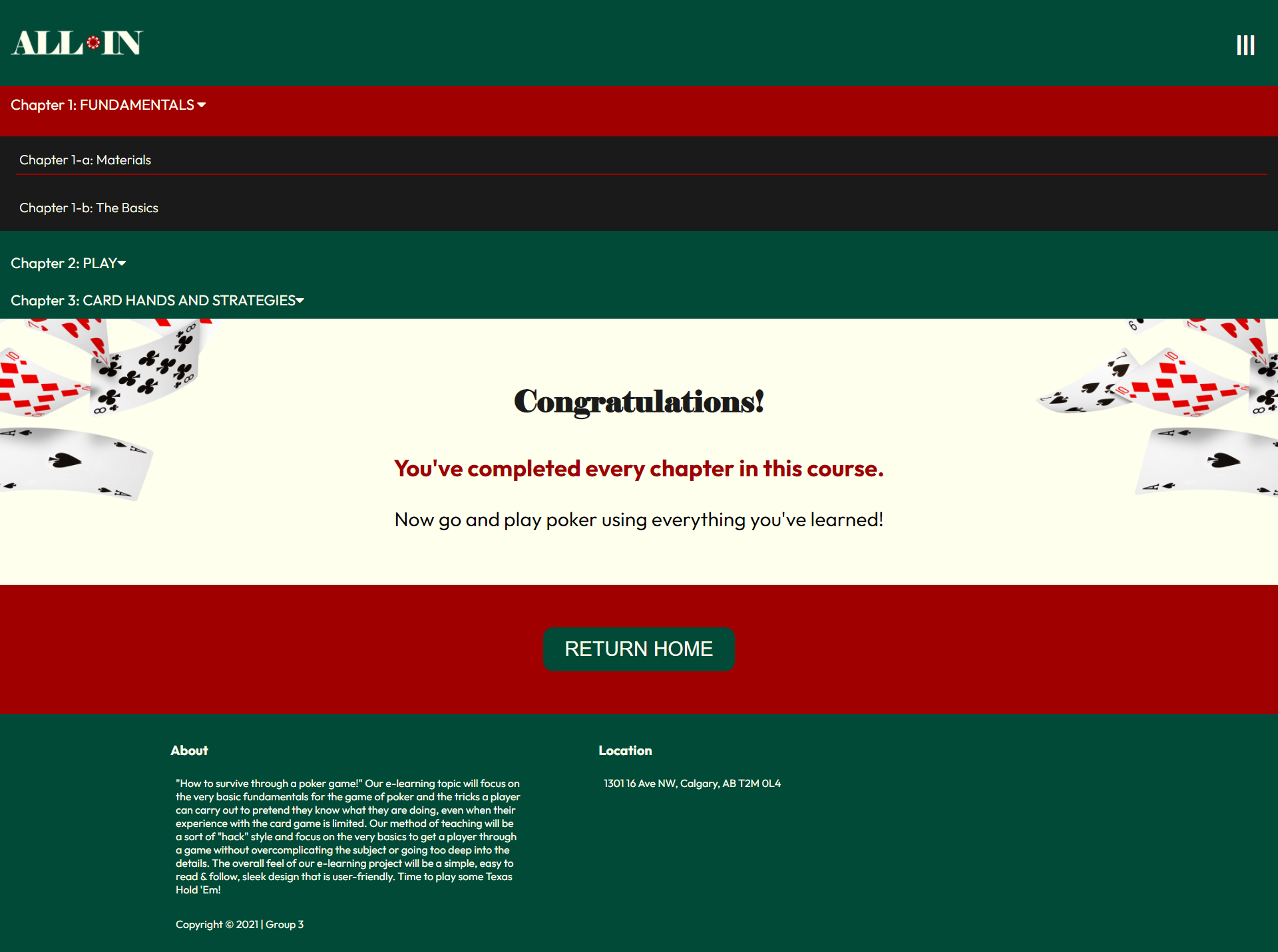
Have you ever been invited to a poker game and you didn't know how to play? My team's goal for this project was to create a simple and digestable course to cover all the basics of this classic card game. As team leader of the project I was responsible for directing the visual and techical feel of the site. Check it out below. It's time to go ALL-IN.
VISIT THIS SITE.
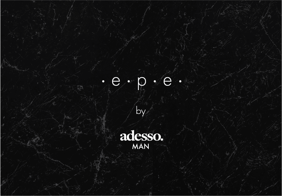
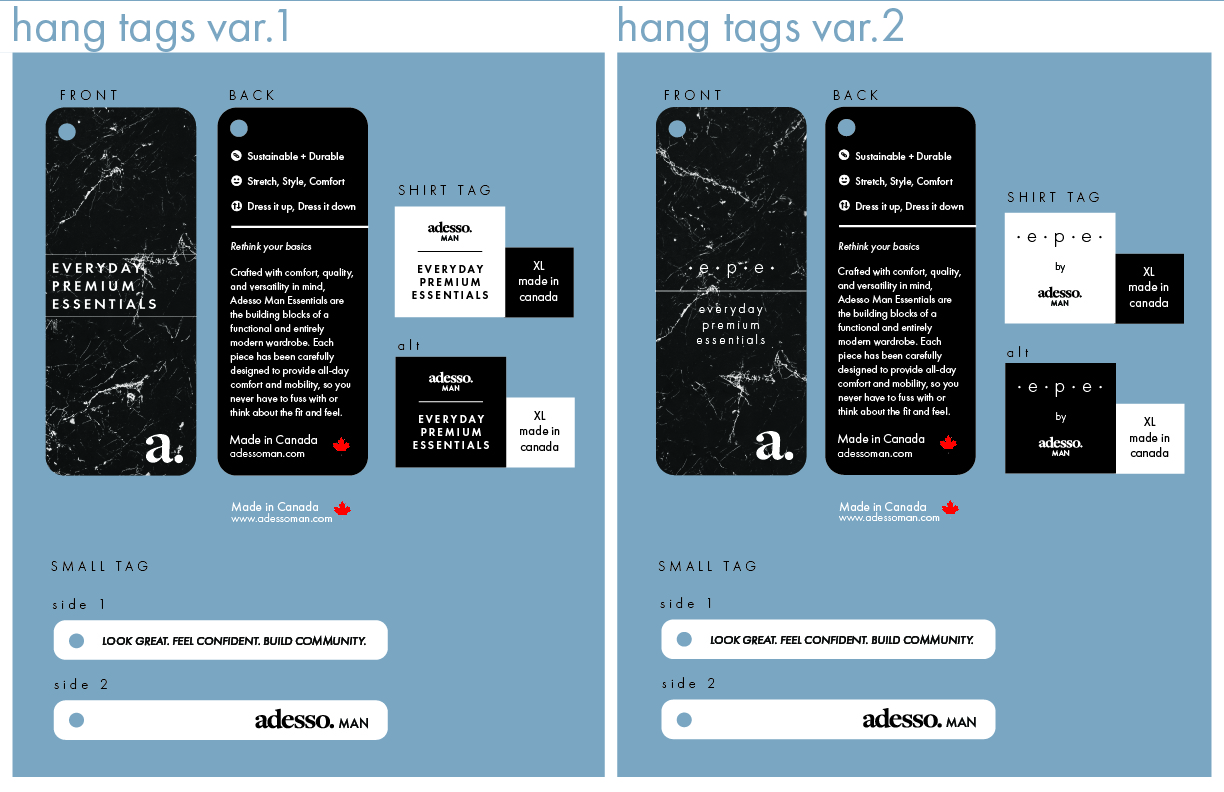
Adesso Man is a Calgary born men's lifestyle company. Their goal is to provide quality products at an affordable price by catering to and supporting Canadian brands. Adesso focused on grooming and accessories for their first 3 years of business and found it was time to tackle apparel. I was tasked with the branding for this new fashion line. I drew inspiration from their already minimalistic branding. The intent was to give the clothing line an air of sophistication and simplicity, which would be reflective of the clothing design itself with the apparel being a set of clothing essentials ie. plain t-shirts, hoodies and joggers.
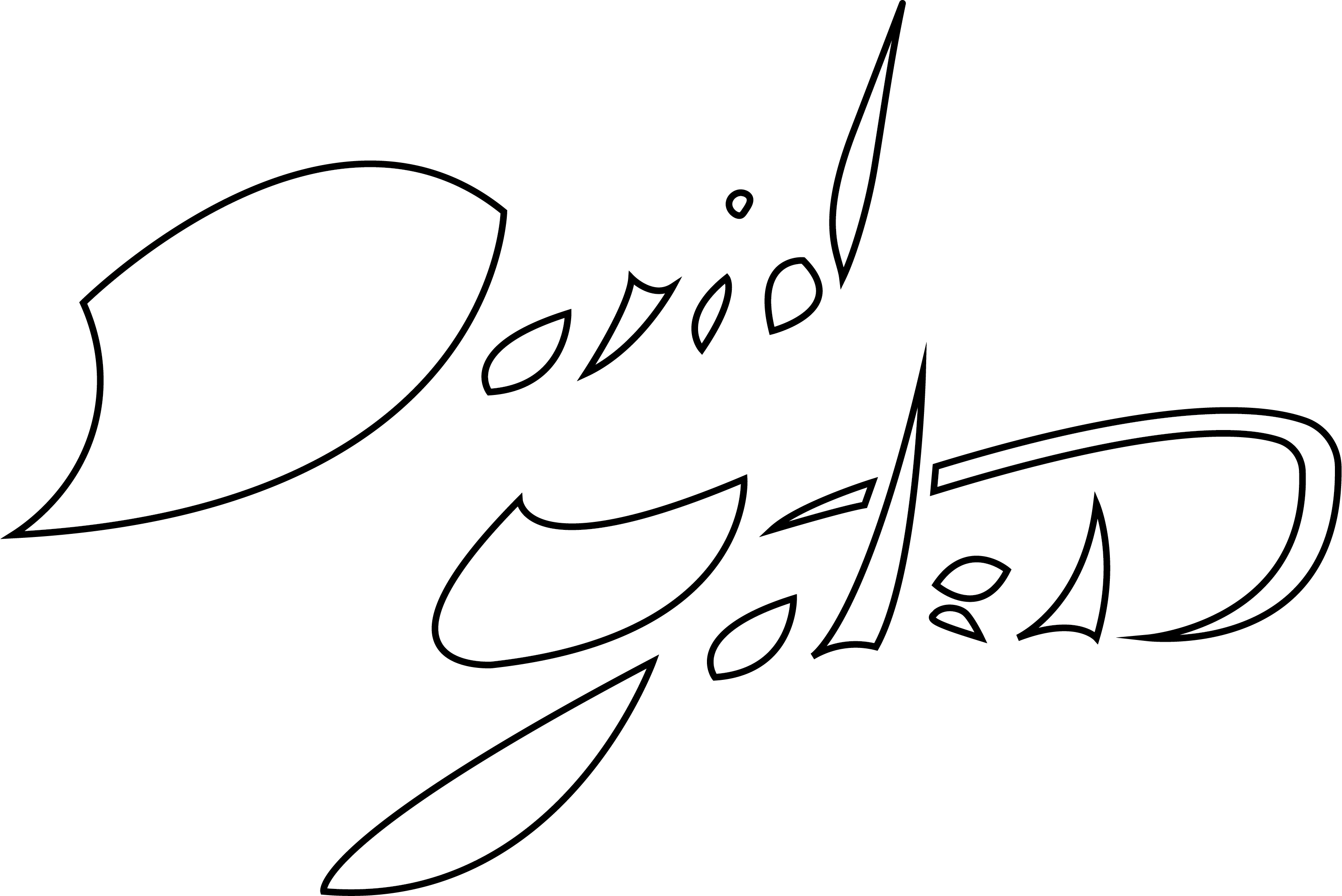
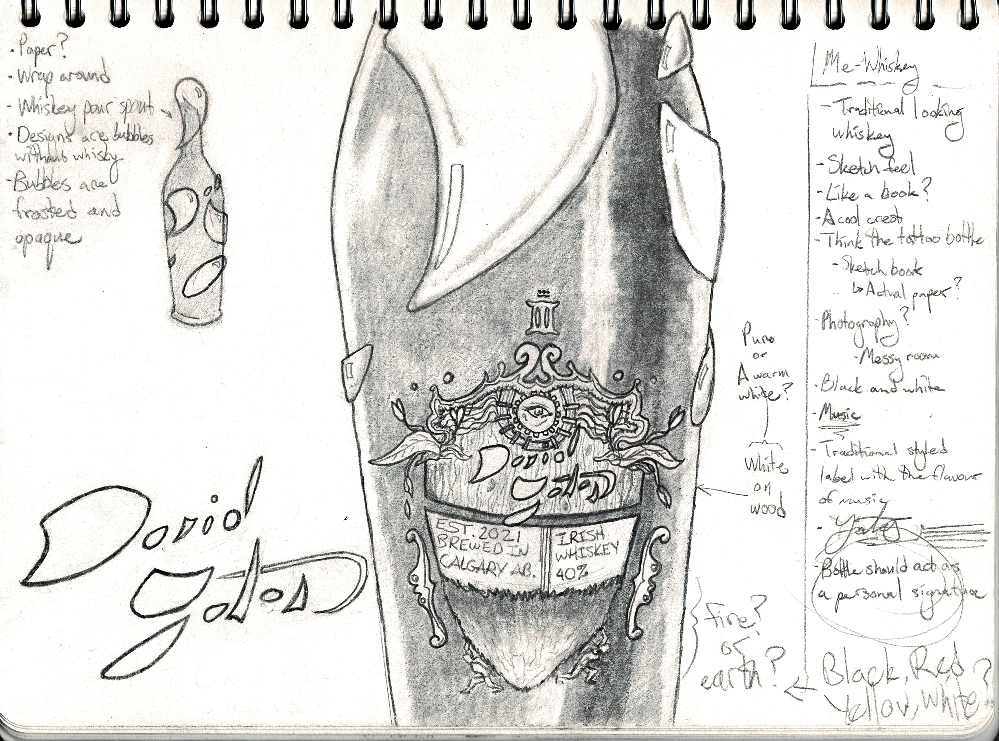
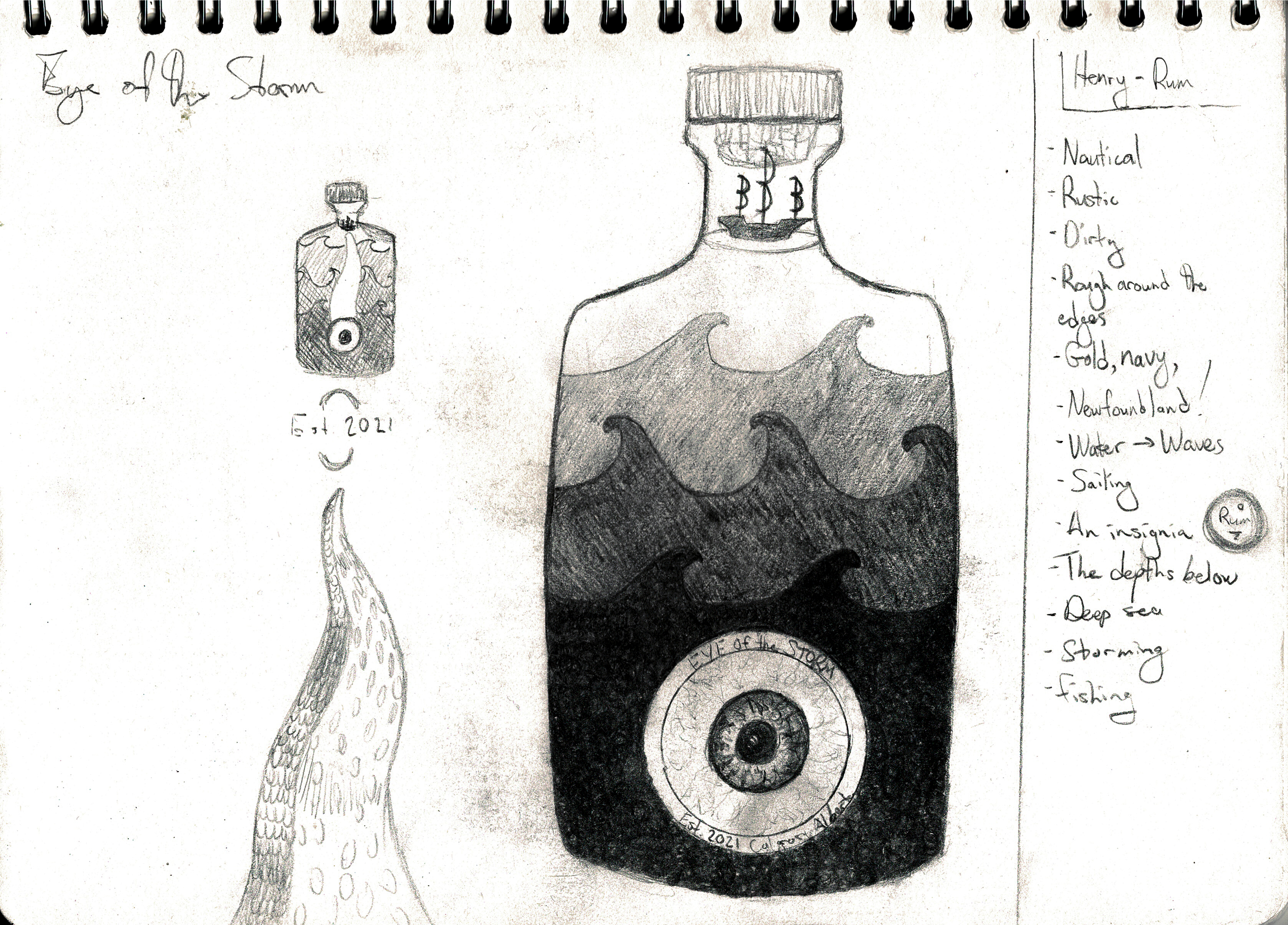
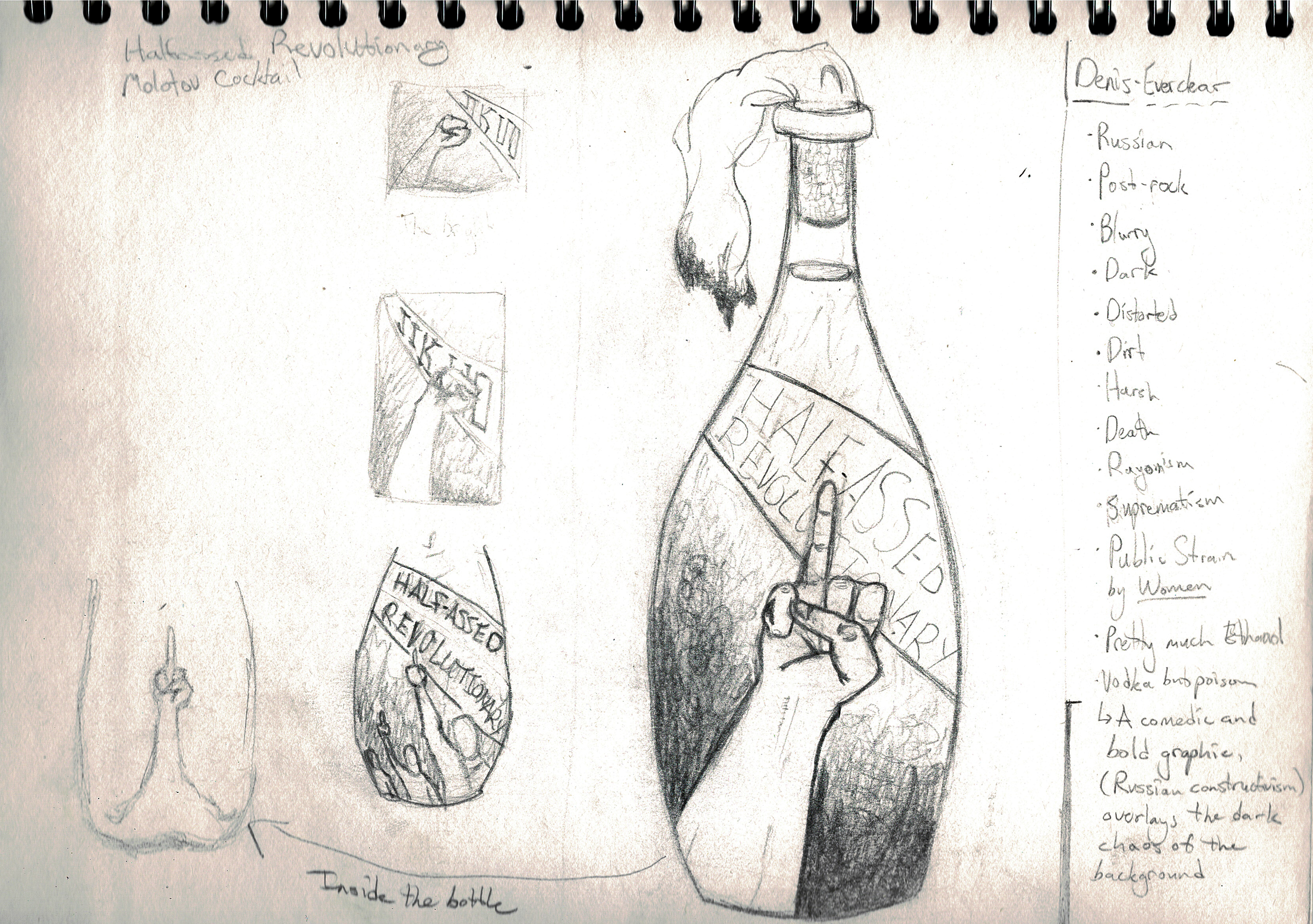
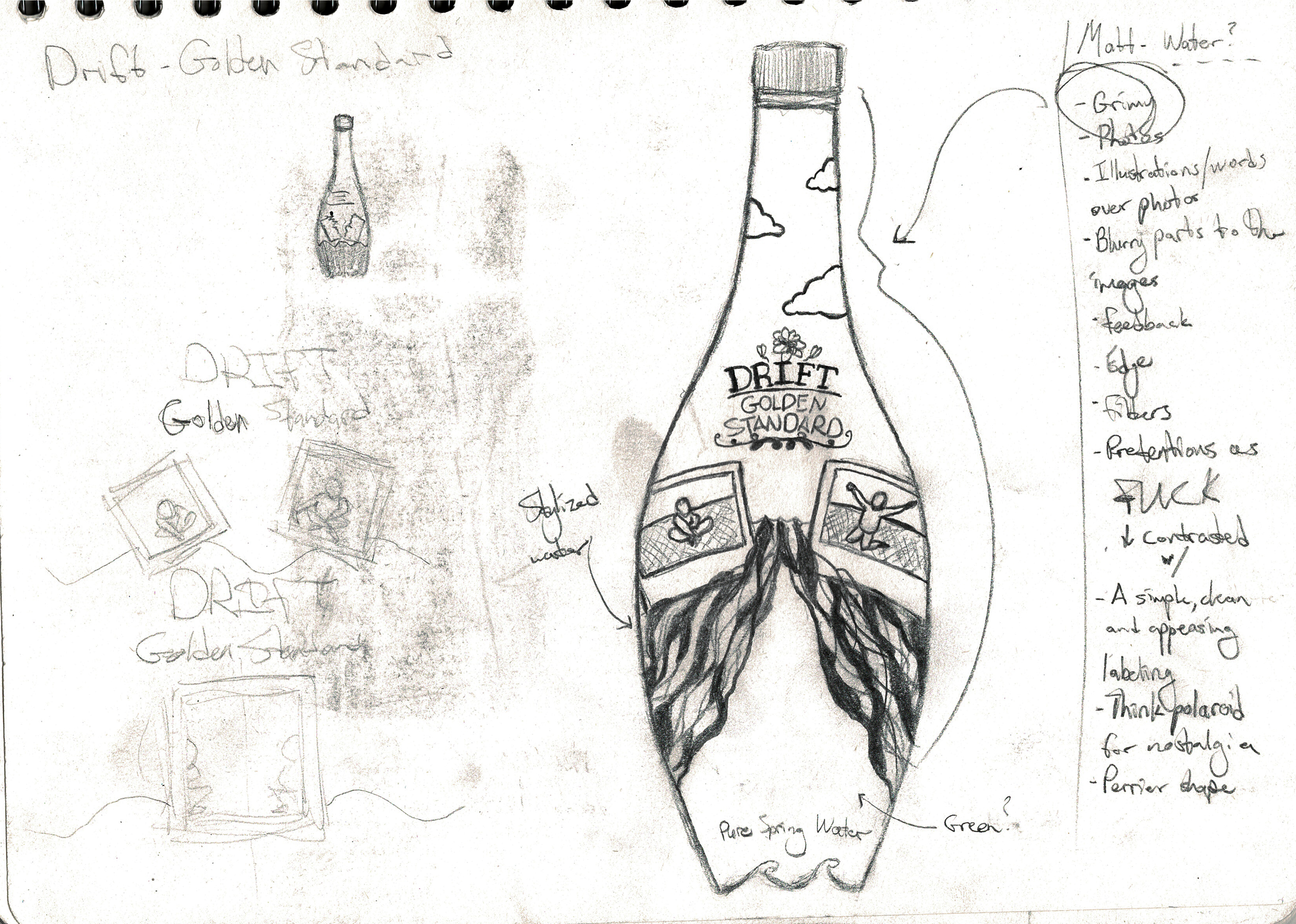
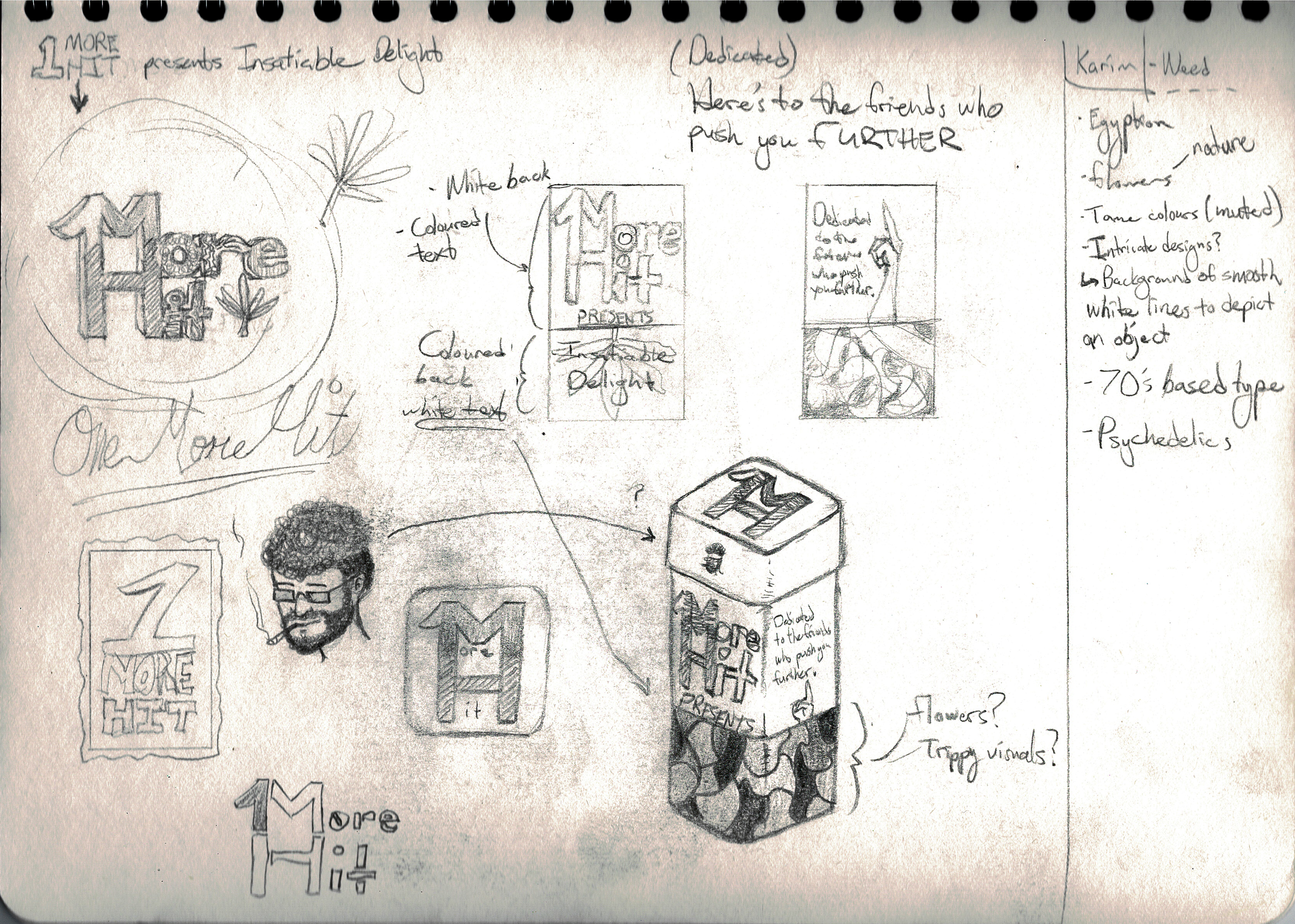
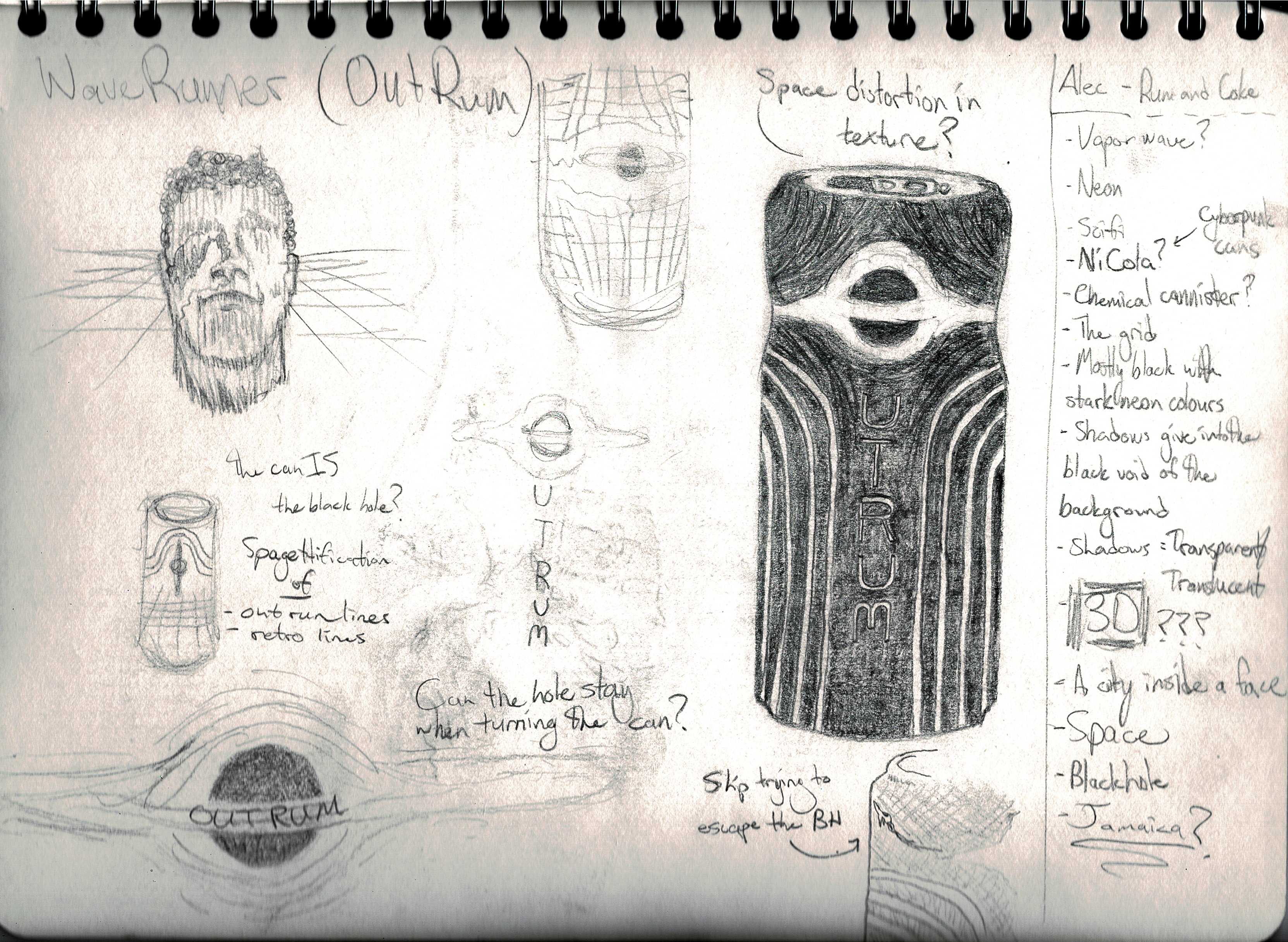
I have a particular passion for branding and an even more particular interest in liquor branding. I believe the medium has unlimited potential for creativity thanks to the versatility of glass. Despite that, when I peruse the liquor store I find very little variety apart from the brands unique sticker label. Through this project, I aim to create 5 liquor brands based off of each of my closest friends and take unique risks to change the way liquor bottles/cans are approached.
.jpg)
.jpg)